27 Tips For Your Personal Trainer Business Cards
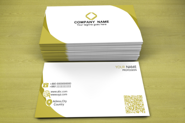
In any occupation, business cards are a valuable tool for marketing your business. The fitness industry is certainly no exception.
In this blog, we’ll discuss the importance of a personal trainer’s business cards as well as how to create the perfect ones for your business. We’ll hit you with a ton of tips to give you the best chance of making the cards work for you.
Read on for the ultimate guide to your personal trainer business cards!

Why Do I Need Business Cards For Personal Training?
So you’ve gotten your personal trainer certification. And you may be wondering what’s next for marketing your new business.
Related:Complete Guide To Writing Your Personal Trainer Resume
With so many new and great marketing strategies out there, why business cards?
Personal trainer business cards are especially important for referral building. A lot of personal training clients come from word-of-mouth referrals by happy customers. Building your network and brand in the fitness world allows you to market your services to a specific niche and earn more referrals. This leads us right into our next point: networking.
Networking is one of the best ways to make money in any occupation, especially fitness. A lot of personal trainers don’t have an extensive network in the fitness industry. Business cards are a great way to build your network and gain important connections throughout any community you work in.
Finally, business cards allow you to market yourself more efficiently. They’re small enough to always be on you and accessible to those looking for help. This means that whether you’re networking or handing out referrals, your name will always be at the forefront of someone’s mind!
27 Tips For The Perfect Personal Training Business Card
Now that you have a better idea of the importance of business cards, let’s dive right into creating them.
According to a study from Statistic Brain Research Institute, 72% of peoplewill judge a company, person or service based solely on the quality and appearance of their business cards. So here, we’ll throw 25 tips your way to help create the perfect personal trainer business card!
#1: Get Creative
Being creative is certainly one way to stand out from other trainers in any area. You can use colors or different fonts to reflect your personality and create a unique card. However, this isn’t the only way to be creative. You could also get creative with materials or design! We’ll get to those in the next tips.
#2: Do Not Limit Yourself To Standard Size Cards
You could go small and create mini business cards. These little cards are great for sticking in a pocket or wallet. You could even place them on your personal training equipment for easy access (and potential business).
#3: What About Different Shapes?
If you’re not into the idea of mini cards, you could go big and consider different shapes! Out-of-the-ordinary shapes are sure to catch people’s eyes. Just be careful not to give them a card that’s difficult to grab. Make it easy for your clients to take your information by considering what shape you want.
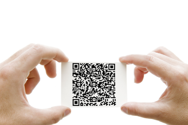
#4: Don’t Forget About QR Codes

If business cards are all the rage in your area – consider getting creative with QR codes! If people have smartphones, they can simply scan the barcode with an app and it will link them to your website or contact information.
#5: Know That You Can Have Two Lines Of Text
One line of text is okay, but two lines makes you look more professional. This is because you can list two different services. This is useful for people who offer more than just personal training!
#6: …But Don’t Go Over Three Lines Of Text
We recommend keeping it short and sweet. This includes the type of information you put on your card! Remember to keep your contact information easy to read, especially if it’s in a smaller font.
#7: Don’t Use Weak Fonts And Colors
Using a weak color or font is not only unprofessional but unattractive. No one wants to hire someone who can’t be bothered to make an effort. Although you may want to match your information with your clothes or personality, keep it professional!
#8: Don’t Embellish
Adding clipart is also a big “no-no.” It’s not only unprofessional but can make it hard for people to read your card. You don’t want that! Make sure that the only embellishments are things that are necessary. For example, you could add your logo if it’s not too flashy.
#9: Make Sure It’s Free Of Mistakes!
Spelling mistakes make you look unprofessional and incompetent. Before printing out any cards, be sure to proofread them thoroughly!
#10: Keep It Simple And Easy To Read
This means keeping your information on the card clear and concise. You don’t want your reader trying to guess what you’re trying to say, especially if it’s important!
#11: Only Use Relevant Information On Your Card
Don’t go crazy with personal information. The only time you should be putting your resume on your card is if you’re a personal trainer who also has other job titles (or it’s relevant to the type of person who would need a personal trainer).
#12: Use Only One Font Type And Size
Using two different fonts makes your card look unprofessional. Pick one font and stick with it. If you’d like to use multiple sizes of your font, go right ahead. However, don’t mix between two different fonts in the same card!
#13: Allow For Clear Contact Information
Be sure to leave room for your contact information, especially so it’s easy to read and grab. Remember that phone numbers and email addresses should be in descending order (from the largest font size to smallest). This will make it easier for the reader to get your information.
#14: Allow For Clear Text Below Your Name And Title
This means that you should keep your name and job title in descending order from largest font size to smallest. The text below this section should be smaller than the font size of your name but larger than the rest of your information. This will make it easier for the reader to get your information.
#15: Make Sure There’s Room For A Signature
If you’re going to have a spot for a signature, be sure there is ample room in order to keep it professional! Don’t forget that when someone signs their name on a card, it usually takes up a larger space than normal.
#16: Include Your Physical Address And City (If You Have One)

Do you rent gym spaceor have an office? Be sure to include the address – and make sure that it’s easy to read so the recipient knows where you offer your services! You want them to feel inclined to reach out or stop by when they have questions about what you do.
#17: Add A Logo If It Is Relevant
Adding a logo can make you seem more professional. This doesn’t mean that everyone needs to have a logo, but it could be useful if your services are unique or hard to describe. For example, personal trainers often find it useful as a way for clients to remember what they do!
#18: Make Sure Your Logo Doesn’t Make The Card Unreadable
Although your logo can be important, it shouldn’t take up the entire card. This is why you should make sure there’s ample room to write underneath the logo.
#19: Don’t Forget To Include A Keyword!
This is especially useful if you attend seminars or conventions! Not only will it make it easier to remember you, but it could stand out among the sea of other attendees.
#20: Ask Clients For A Referral!
Not sure what to actually say on your card? Why not ask your clients for a referral? Simply add something like “feel free to give this card to anyone who may be interested in my services!”
#21: Ask For Their Email Address
If you want their business email address, add something like “email me at” and put your email on the card. This is a great way to keep the conversation going after they’ve taken your card!
#22: Don’t Make It Oversized!
Business cards are meant to be kept in a wallet or pocket on-the-go. If you don’t take into consideration that they’ll need to fit in a wallet or pocket, you might end up with a card that’s too big. No one will be able to keep it on them!
#23: Experiment With Textures
One way to make your card stand out is by experimenting with textures. This can also be a great way to showcase your design abilities!
#24: Make Your Business Cards Interactive
Allowing your recipient to engage with your business cards adds a whole different level of uniqueness. Try holographic, an origami card, or even a business card that doubles as a USB stick.
#25: Offer An Incentive
You’re more likely to get someone’s business if you offer them something in return. Try offering a free session, coupon code for online purchases, etc. Be sure to follow up with this incentive so it’s not forgotten about!
#26: Include Testimonials
This is because customer testimonials can help build your credibility and come across more professionally. Add in a brief blurb and a picture of them so you can show off your close relationships with clients!
#27: Include Your Social Media Profiles
Having your social profiles on a business card is a great way to keep in touch with your existing and potential clients. Since there’s no such thing as too many social media profiles, go with your gut and pick the ones that you feel are best!
Business Cards Are Just The Beginning
Creating personal trainer business cards isn’t difficult if you know what you’re doing. By following these simple steps and knowing what to do and what not to do, you’ll be able to create a card that works for your business!
For new trainers, exploring personal trainer business card templates free can simplify the design process and save time.
If you’re aiming for customization, many platforms also offer fitness business card templates free, which you can tailor to your brand colors and style.
Personal trainer business cards are a great way to keep in touch with your clients and keep your business relevant. However, they aren’t the only ways you can market yourself!
Want to learn more about running your personal training business?Check out our Business and Sales CEU course.

How to Become a Personal Trainer in 5 Simple Steps

Personal Trainer in 2020

Personal Trainer Salary

Top 5 Exercise Science Careers

To Our Blog


